jade 1.png
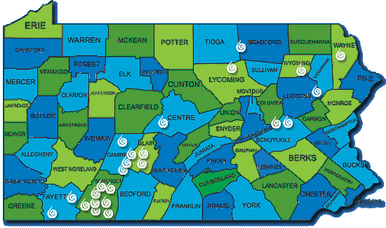
A map showing the locations of current wind turbine fields in PA
jade 2.png
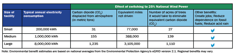
A chart showing the estimated benefits of wind energy by facility size
Jade 3.jpg
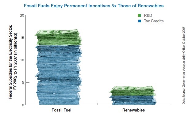
A graph illustrating the disparity in federal subsidies received by fossil fuel and renewables
jade 4.png
A graph showing the recorded and predicted reductions in emissions from using wind energy
taylor 1.png
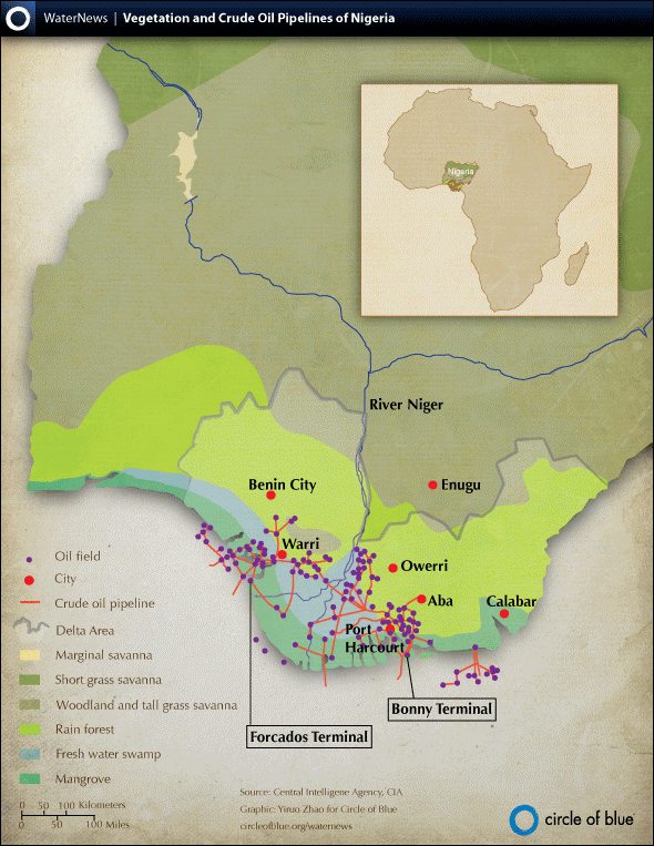
Figure 1: “Map: Oil Pipelines and Vegetation in the Niger Delta”
Rachel 1.jpg
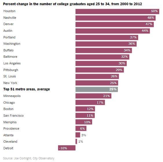
Figure 1: Percent Change in Number of College Graduates From 2000 to 2012
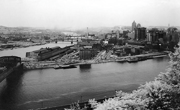
Rachel 2.png
Pittsburgh Before
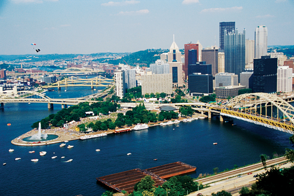
Rachel 3.png
Pittsburgh After
